Money
Am I wealthy?
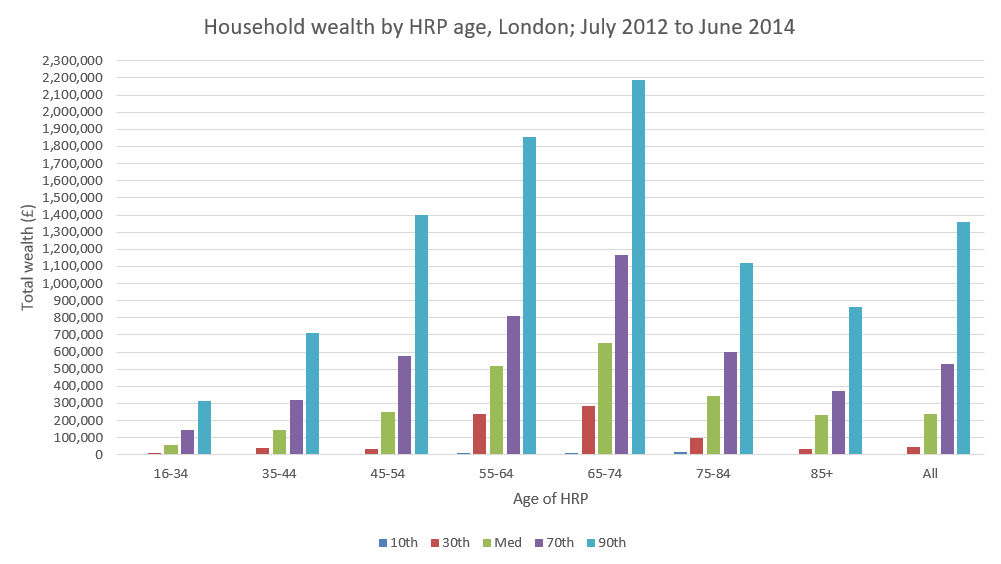
I have no savings really, so I already knew the answer was no. I wanted to find out how everyone else was doing though, so after trawling the ONS site for a couple of hours, I found this data set.
I think I’ve put it into a graph correctly, so if you want to see how wealthy you are compared to people in your age bracket in London, enjoy:

I was surprised by how high the wealth of the top 10% is. I’ve read that this is likely to be underestimated, I guess because the more money you have, the wiser the investment in a clever accountant to hide it.
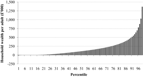
It doesn’t look like the top decile is skewed as much as you might assume (from this article):

Inflation, it’s really rather dull
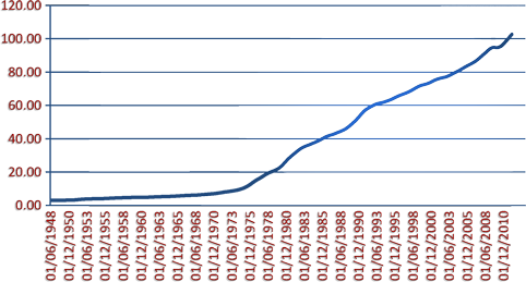
Today I decided to graph how much I get paid in an attempt to deduce how much I’ll be paid in five years (which is obviously massively flawed, but amusing none the less). Whilst trying to decide whether the trend line should be linear or exponential (and hoping that exponential will be closer to reality) I thought I’d use inflation as a guide. I’m not sure why, I guess I just went off on a tangent. Anyway, it turns out the internet is full of graphs of inflation, but none appear to be cumulative. Not this one:

The graph shows how the price of a pint (or anything which cost around 3 pence / 7d in 1948) would have changed if it was only affected by inflation. It isn’t exponential, as I had expected, but more the product of two linear plots. What the hell happened in the 70s?! The advent of neoliberalism, OPEC oil embargos and Margaret Thatcher apparently.
Source: ONS, via The Guardian.